Saturday
3 Best combination of packaging and typography
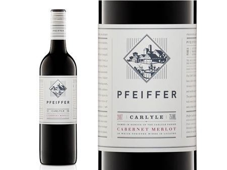
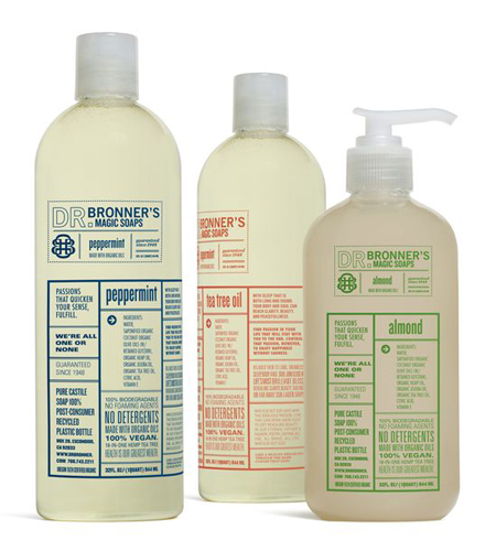
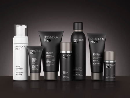
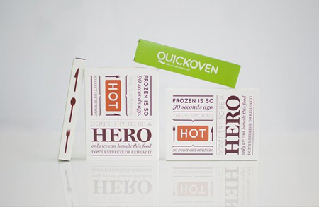
Combining nice typography and packaging in a harmonious way can be challenging. But these designers have done it well, sometimes designers use the typography as the central element on packages, and the the result can be quite astonishing like these examples below - Enjoy
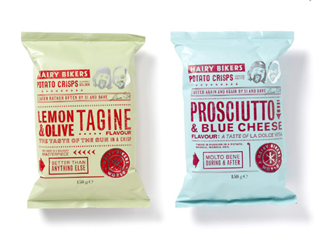
1. Hairy Bikers
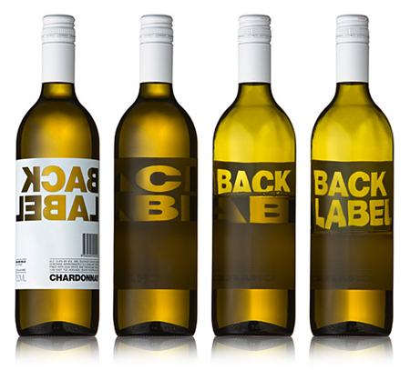
2. Back Label
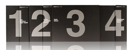
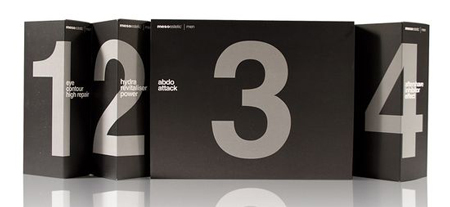
3. Ms Men
4. Pfeiffer wine labels
5. Dr Bronner’s Magic Soap (student work)
6. Skeyndor men
7. QuickOven
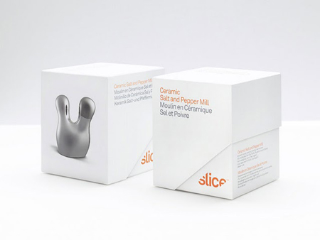
8. Slice
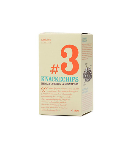
9. Delights of Sweden
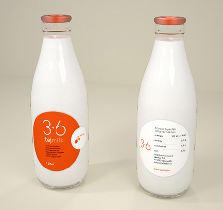
10. tej milk
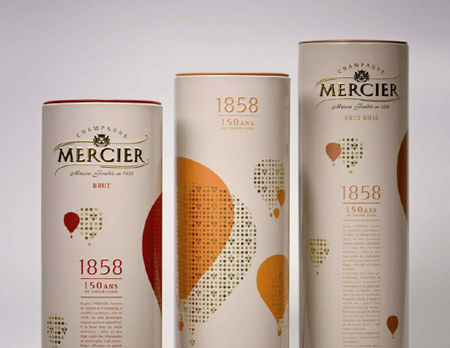
11. Mercier Champagne
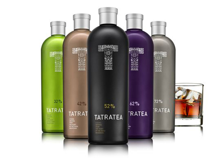
12. Tatratea
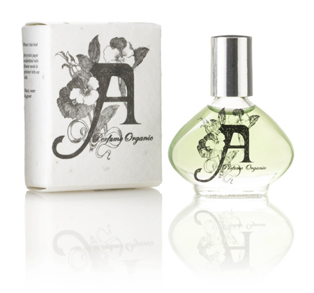
13. A Perfume Organic
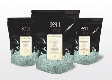
14. Solberg & Hansen Coffee
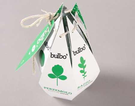
15. Bulbo (student work)
16. a.o.
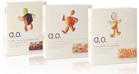
17. Glorious! soup
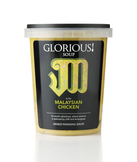
18. Fling chocolate
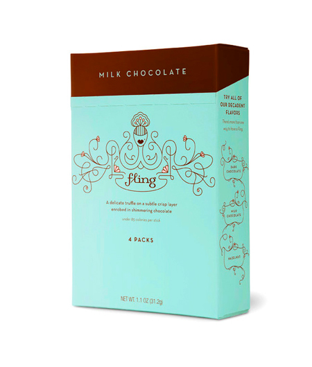
19. Breuckelen distilling
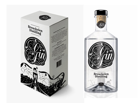
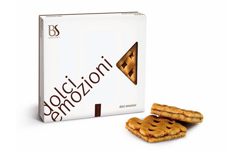
20. Dolce Emozioni
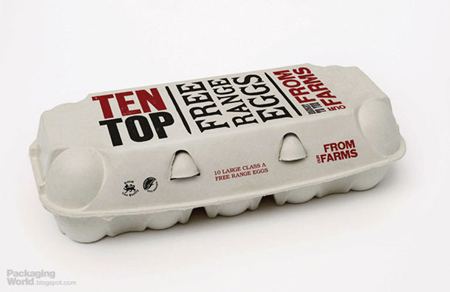
21. Eggs from farm
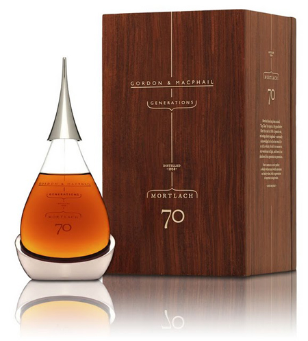
22. Mortlach 70
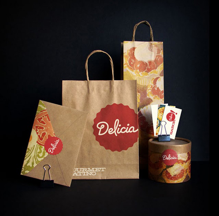
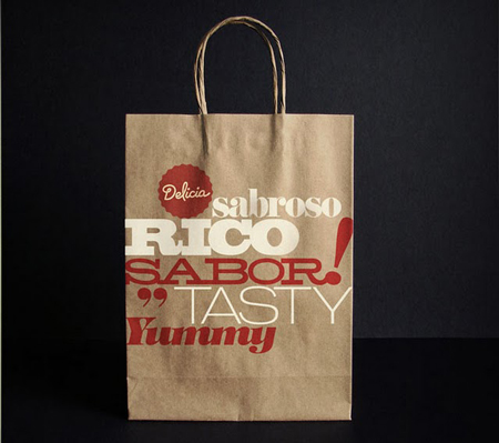
23. Delicia
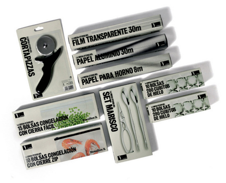
24. La Sirena
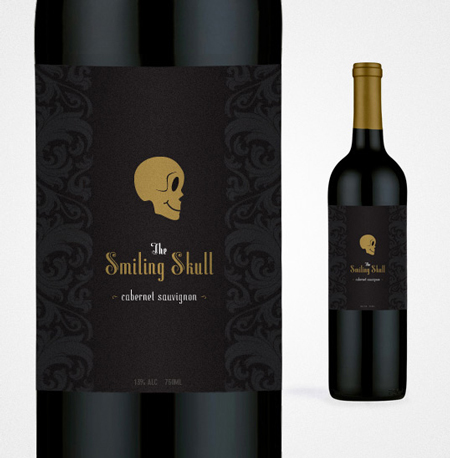
25. The Smiling Skull
| About The Author | ||||
|
If you enjoyed this post, please retweet or stumble to say thanks!
Monday
3 Amazing World War 1 Posters
As a Graphic Designer it's amazing to see how far both design and technology have come since The World War 1. In regards to design, one can only wonder what the designer was thinking when creating these. Or were they real designers? What you think? leave your comments bellow - Enjoy!


| About The Author | ||||
|
If you enjoyed this post, please retweet or stumble to say thanks!
Subscribe to:
Comments (Atom)


