
Friday
0 Best Information About Visual Hierarchy: How Well Does Your Design Communicate?
The goal of visual design is to communicate. How you organize and prioritize your elements conveys valuable information
about their relative importance. Visual hierarchy aids comprehension,
reinforces your message, and guides your visitor through your story.
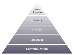
 photo credit: dougbelshaw
Through basic design principles you emphasize one element over another so more important content looks more important. You design related elements to provide visual cues that those elements are on the same level in the hierarchy. You organize everything on the page to create a sense of order.
Visual hierarchies create centers of interest on your page, communicate additional meaning through convention and repetition, highlight actions you want your visitors to take, and establish patterns of movement and flow.
Ultimately the visual hierarchy you establish tells a story about your page and site.

photo credit: M i x y
Web pages and websites have a lot of information to communicate. When we land on a new page we immediately have some questions we need answered.
We make it easier for visitors to find what they’re looking for. We create clear paths to completing tasks and highlight actions the visitor wants to take and that we want the visitor to take. We communicate messages that reinforce or add to the copy.
One of the first things you learned with html was probably the heading tag. Headings are hierarchy and make some words more important than the rest of your type. Tags for blockquotes and lists, strong, and em, also add a visual hierarchy to your typography.
Compare the two images below, one with no hierarchy and one with a clear hierarchy.

The image on the left has no hierarchy and as a result anyone visiting the page will need to do a lot of work to determine if this page is what they want. Assuming it is, the visitor has no choice, but to read every word on the page to find the bits of information they’re interested in or need to complete their task.
The image on the right on the other hand makes the page easy to scan. It’s easily scanable and won’t require much effort for the visitor to determine if she’s on the right page. Assuming she is, the page leads her quickly to the information she wants or needs.
Which of the two designs is more inviting? Which will more likely be read? Which will more effectively communicate?
I mentioned above that visual hierarchies create centers of interest. Every web page should have a goal. That goal might be as simple as having the content read or it may be to entice a visitor to enter your sales funnel. Every page should have some primary element you want your visitors to notice.
Visual hierarchy makes clear the primary, secondary, and supporting elements on the page.
photo credit: erix!
Contrast shows relative importance. Without being told you know the larger text is more important than the smaller text. An h1 heading is bigger than an h2 heading is bigger than an h3 heading. Bigger grabs our attention first and so comes across as more important.
Repetition attaches meaning to new elements. Think blue underlined links. You’ve seen them before and the next time you see them you bring with you information about them. Repetition instantly communicates that elements are at the same level in the hierarchy.
Alignment creates order. It allows you to quickly connect elements across the page and helps define start and end points. Think grids.
A single element that breaks the established alignment calls attention to itself and it’s importance. Think of a pull quote. Visually it gives you clues it’s an important concept taken from within the text.
Proximity groups elements within a hierarchy and creates new sub hierarchies. Your home page has three offers for different products or services. Each might have a heading, a descriptive paragraph, an image, and a link to more information. The specific design elements would be on a different hierarchical level, but each offer (by containing the same 4 elements) connects the offers as being at the same hierarchical level.
photo credit: aussiegall
I mentioned some of the things that affect visual weight in a previous post on balance in web design. In that post we looked at controlling visual weight to balance our entire composition. Here we’re looking to create a hierarchy.
The mechanisms for controlling visual weight are the same in both cases.
Your own judgement can lead you here. Look at any two elements and think about which carries more weight. Ask yourself why, what is it about one element that makes it heavier than another.
photo credit: Banalities
It’s important to remember that before actually designing a hierarchy we take the time to think about our content and what should be seen as more important on a page. Just because you can make a piece of text stand out doesn’t mean you should.
Your hierarchy should begin with thoughtful consideration of the content and goals of the page. Only after you’ve decided intellectually the hierarchy of your page should you attempt to visually design that hierarchy.
In a presentation on Communicating with Visual Hierarchy (pdf), Luke Wroblewski, offered this summary:
What is Visual Hierarchy?
A hierarchy is an organization of items into different levels of relative importance. Visual hierarchy is naturally enough creating this organization and prioritization visually.Through basic design principles you emphasize one element over another so more important content looks more important. You design related elements to provide visual cues that those elements are on the same level in the hierarchy. You organize everything on the page to create a sense of order.
Visual hierarchies create centers of interest on your page, communicate additional meaning through convention and repetition, highlight actions you want your visitors to take, and establish patterns of movement and flow.
Ultimately the visual hierarchy you establish tells a story about your page and site.
Why is Visual Hierarchy Important?
Very simply, because it more effectively communicates information. We are visual beings and can quickly pick up on visual cues to better understand our environment.Web pages and websites have a lot of information to communicate. When we land on a new page we immediately have some questions we need answered.
- Is what I’m looking for on this page?
- Where is it?
- How do I complete my task?
We make it easier for visitors to find what they’re looking for. We create clear paths to completing tasks and highlight actions the visitor wants to take and that we want the visitor to take. We communicate messages that reinforce or add to the copy.
One of the first things you learned with html was probably the heading tag. Headings are hierarchy and make some words more important than the rest of your type. Tags for blockquotes and lists, strong, and em, also add a visual hierarchy to your typography.
Compare the two images below, one with no hierarchy and one with a clear hierarchy.
The image on the left has no hierarchy and as a result anyone visiting the page will need to do a lot of work to determine if this page is what they want. Assuming it is, the visitor has no choice, but to read every word on the page to find the bits of information they’re interested in or need to complete their task.
The image on the right on the other hand makes the page easy to scan. It’s easily scanable and won’t require much effort for the visitor to determine if she’s on the right page. Assuming she is, the page leads her quickly to the information she wants or needs.
Which of the two designs is more inviting? Which will more likely be read? Which will more effectively communicate?
I mentioned above that visual hierarchies create centers of interest. Every web page should have a goal. That goal might be as simple as having the content read or it may be to entice a visitor to enter your sales funnel. Every page should have some primary element you want your visitors to notice.
Visual hierarchy makes clear the primary, secondary, and supporting elements on the page.
How Does Visual Hierarchy Express Meaning?
Think of the basic design principles contrast, repetition, alignment, and proximity. Each allows us to add relative meaning to information.Contrast shows relative importance. Without being told you know the larger text is more important than the smaller text. An h1 heading is bigger than an h2 heading is bigger than an h3 heading. Bigger grabs our attention first and so comes across as more important.
Repetition attaches meaning to new elements. Think blue underlined links. You’ve seen them before and the next time you see them you bring with you information about them. Repetition instantly communicates that elements are at the same level in the hierarchy.
Alignment creates order. It allows you to quickly connect elements across the page and helps define start and end points. Think grids.
A single element that breaks the established alignment calls attention to itself and it’s importance. Think of a pull quote. Visually it gives you clues it’s an important concept taken from within the text.
Proximity groups elements within a hierarchy and creates new sub hierarchies. Your home page has three offers for different products or services. Each might have a heading, a descriptive paragraph, an image, and a link to more information. The specific design elements would be on a different hierarchical level, but each offer (by containing the same 4 elements) connects the offers as being at the same hierarchical level.
What Aspects of Design Control Visual Hierarchy?
You create a hierarchy in design, by adjusting the visual weights of your element. More visual weight is seen as more important. Less visual weight is seen as less important.I mentioned some of the things that affect visual weight in a previous post on balance in web design. In that post we looked at controlling visual weight to balance our entire composition. Here we’re looking to create a hierarchy.
The mechanisms for controlling visual weight are the same in both cases.
- Size – As you would expect larger elements carry more weight
- Color – It’s not fully understood why, but some colors are perceived as weighing more than others. Red seems to be heaviest while yellow seems to be lightest.
- Density – Packing more elements into a given space, gives more weight to that space
- Value – A darker object will have more weight than a ligher object
- Whitespace – Positive space weighs more than negative space or whitespace
Your own judgement can lead you here. Look at any two elements and think about which carries more weight. Ask yourself why, what is it about one element that makes it heavier than another.
Summary
Hierarchies help give order. They prioritize items and aid in communication. Visual hierarchies organize, prioritize, and communicate visually by modifying the visual weights different elements carry.It’s important to remember that before actually designing a hierarchy we take the time to think about our content and what should be seen as more important on a page. Just because you can make a piece of text stand out doesn’t mean you should.
Your hierarchy should begin with thoughtful consideration of the content and goals of the page. Only after you’ve decided intellectually the hierarchy of your page should you attempt to visually design that hierarchy.
In a presentation on Communicating with Visual Hierarchy (pdf), Luke Wroblewski, offered this summary:
- Visual Communication is part
- Visual Organization and part personality.
- Visual Hierarchy is a deliberate prioritization of
- Visual Weight enabled by the manipulation of
- Visual Relationships to create
- Meaning for users
- communicate messages
- illuminate actions
- organize information
The 7 Components of Design

| About The Author | ||||
|

If you enjoyed this post, please retweet or stumble to say thanks!
Thursday
4 Best Innovative And Creative Billboards You Should See
Although most billboards are repetitive and boring, there are some companies that design entertaining outdoor billboards. They’re so unique and innovative that they can stimulate much more pedestrians and passengers than normal billboards.
Colorado State Patrol: Tailgating Isn’t Worth It – created by Amelie Company

Miele Vacuum Cleaner – created by Miami Ad School students Jon Kubik and Renee Anderson.

(credit)
Cingular Billboard “Hate Dropped Calls?”

(credit)
Time for Silberman’s Fitness Center – created by Silberman’s Fitness Center

(credit)
Formula Toothcare – “Builds strong teeth” – created by Ogilvy & Mather

(credit)
Pond’s Pore Billboard “Cleans pores. Fights pimples” – created by Ogilvy & Mather

(credit)
Penline Art Supplies “Strong Tape” – created by Euro Rscg Partnership

(credit)
Law & Order Billboard – created by Colenso BBDO, Auckland

(credit)
Detroit Area Council Boy Scouts of America “It’s better outside” – created by Vessela Valcheva and Linus Parr

(credit)
LIVE IN A PLACE WITHOUT BILLBOARDS. John Laing Homes – created by Richter7

| About The Author | ||||
|
If you enjoyed this post, please retweet or stumble to say thanks!
Saturday
1 Minimalist posters explain complex philosophical concepts with basic shapes
The illustrations you see featured below are from a a series entitled "Philographics," and were created by London-based graphic designer Genís Carreras. Using basic colors, simple geometric design, and concise definitions, Carreras manages to cram impressive amounts of information — on philosophical doctrines as diverse as hedonism, determinism, and existentialism — into a surprisingly simple and accessible package.
All descriptions have been transcribed from their respective posters

Existentialism.
Individual is solely responsible for giving his or her own life meaning and for living that life passionately and sincerely, dealing with his or her conditions, emotions, actions, responsibilities, and thoughts.

Idealism.
Experience is ultimately based on mental activity. It is contrasted with realism, in which the external world is said to have an apparent absolute existence. The only things which can be directly known for certain are just ideas.

Realism.
Reality exists independently of observers. In ethics, moral realism takes the view that there are objective moral values. Representative realism claims that humans cannot perceive the external world directly.

Empiricism.
Knowledge arises from evidence gathered via sense experience. Empiricism emphasizes the role of experience and evidence, especially sensory perception, in the formation of ideas, over the notion of innate ideas or tradition.

Deism.
Reason and observation of the natural world, without the need for organised religion, can determine that a supreme being created the universe. This deity does not intervene in human affairs or suspend the natural laws of the universe.

Humanism.
Human being can lead happy and functional lives, and are capable of being ethical and moral, without religion or dogma. Life stance emphasises the unique responsibility facing humanity and the ethical consequences of human decisions.

Dualism.
Mind and matter are fundamentally distinct kinds of substances. Human beings have both of them, mind or soul and body. Moral dualism is the belief of the greater complement or conflict between the good and the evil.

Hedonism.
Pleasure is the only intrinsic good. Actions can be evaluated in terms of how much pleasure they produce. In very simple terms, a hedonist strives to maximize the pleasure and minimize the pain.

Absolutism.
An absolute truth is always correct under any condition. An entity's ability to discern these things is irrelevant to that state of truth. Universal facts can be discovered. It is opposed to relativism, which claims that there is not an unique truth.

Relativisim.
Points of view have no absolute truth or validity, having only relative, subjective value according to differences in perception and consideration. Principles and ethics are regarded as aplicable in only limited context.

Free will.
Agents have the ability to make choices. Individuals can be held morally accountable for their actions. An omnipotent divinity does not assert its power over the will and choices of individuals.

Determinism.
Events within a given paradigm are bound by causality in such a way that any state of an object or event is determined by prior states. Every type of event, including human cognition (behaviour, decision, and action), is causally determined by previous events.

Nihilism.
Life is without objective meaning, purpose, or intrinsic value. Morality does not inherently exist and any established moral values are abstractly contrived. Knowledge is not possible and some aspects of reality do not exist as such.
| About The Author | ||||
|
If you enjoyed this post, please retweet or stumble to say thanks!
Tuesday
248 70 Best Creative Fresh Logo Designs For Your Inspiration
These types of corporate identities are often developed by large firms who specialize in this type of work. However, if you want to save some bucks and want to design your logo then there are many sources to get logo design inspiration. Infact, we might able to help you by presenting this showcase of Highly beautiful, original and creative logo designs for your design inspiration.
Creative Logo Designs For Design Inspiration


| About The Author | ||||
|
If you enjoyed this post, please retweet or stumble to say thanks!
Subscribe to:
Posts (Atom)

