
Friday
0 Vector drawing
 Designers are afraid of precise vector drawing. Many designers have a lot of beautiful logos or types designs, but the bad execution of the path mars the final result.
 Some designers propose a vector drawing system with the point’s handles at 90º or 180º. But, is this the best solution? Now we are going to analyze which characteristics a perfect vector drawing must have.
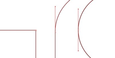
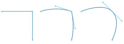 There are 3 kinds of points that let us edit lines and curves in different ways by adjusting their handles: ‘corner point’: their handles can be adjusted independently, ‘curve point’: their handles do not work independently, and ‘connector point’: this point connects a straight line with a curve (tangent). One of the handles becomes inactive and the other one continues the direction of the straight line, on the aim of doing a perfect curve. In every case, their handles can be extended or retracted.
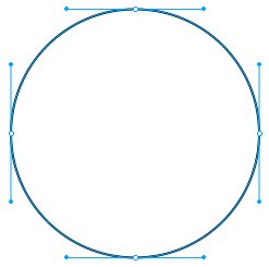 It looks like something obvious, but… where do we place the points?.
To start, we are going to place the handles in 90º and 180º on the axles extremes. As we see in this example, handles and points converge to a common centre.
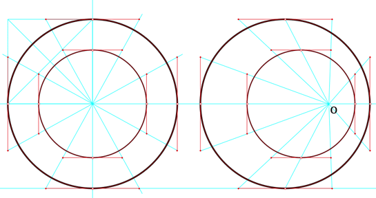 We can note that the model is completely adaptable: the external curves are in direct relation with the internal curves. It’s the same with the handles. In the first example, (above left) we see a perfect circle. Their points are on 90º or 180º. Their handles are extended and their lengths fit within the guide that indicates the 30º of the axles. Furthermore we can note that both circles (internal and external) are completely concentric… we could do 1000 of concentric circles and their guides are going to be the same in every case.
But, what happens if we move the internal circle to the right, for example? In this case (above right), we can see the same principle… the guides of the internal circle still coincide with the guides of the external circle…
Many people may think that learning this could be very useless, but look at the last example again: it could be an ‘U’ serif…
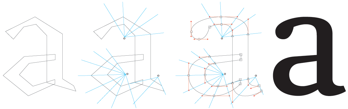 In this last example, we can see these principle applied to an ‘a’ character design. The letterform is perfectly drawn, and look up to the counters… their curves look clear and perfect.
(click on the images to see them in real size).

| About The Author | ||||
|

If you enjoyed this post, please retweet or stumble to say thanks!
Subscribe to:
Post Comments (Atom)


0 comments:
Post a Comment