Thursday
0 Printing Comes to Europe - Graphic Design History 3
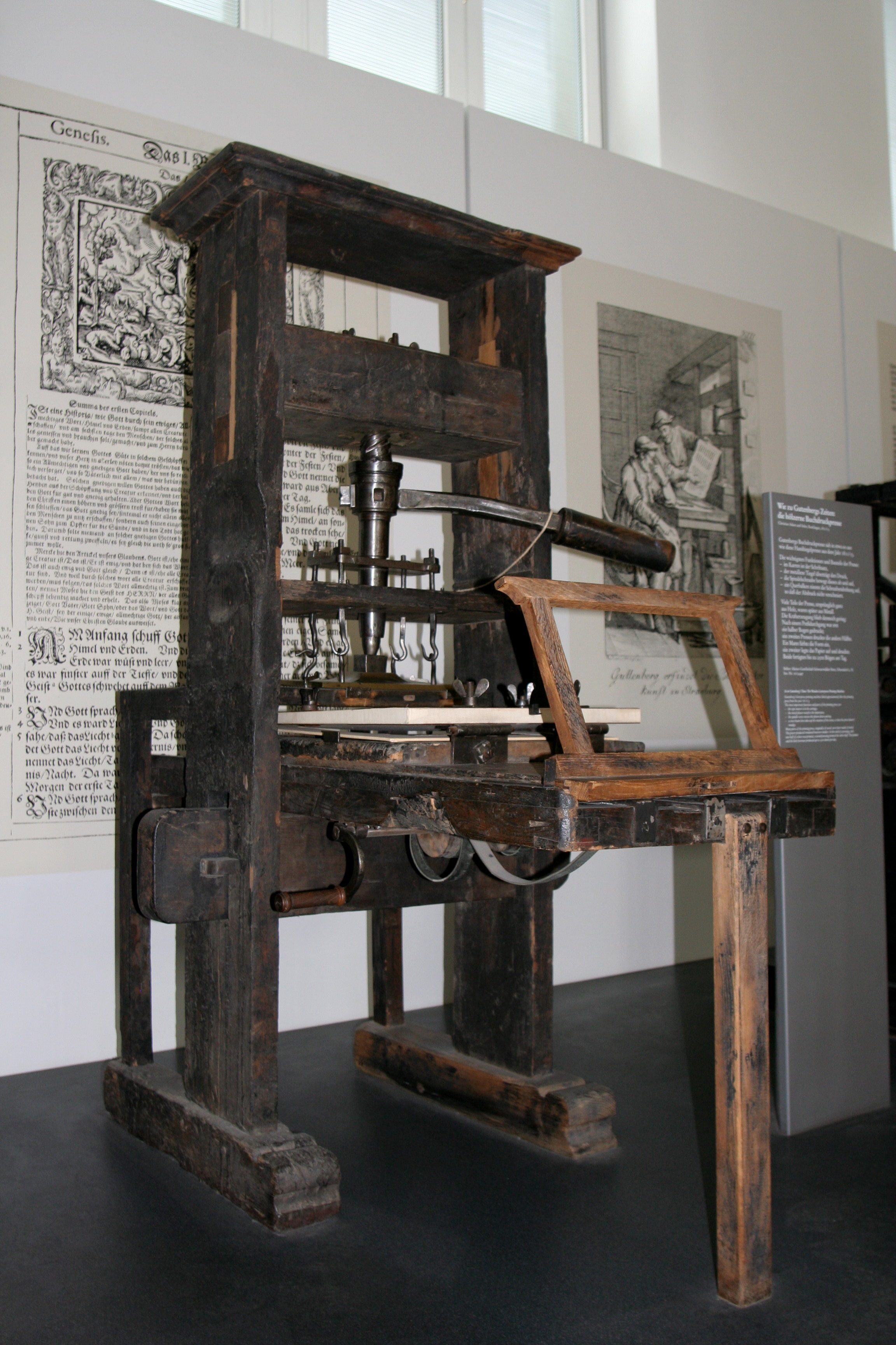
Typography was a new printing method which made advancement in civilization. Multiple prints could be made, literacy increased, and knowledge was being spread much more rapidly. According to Megg's History of Graphic Design, Typography is the term for printing with independent, movable, and reusable bits of metal or wood with raised letterforms. Before typography was even invented, it took about four or five months for a single book to be created. It was also costly and timely. There was a high demand for books since more universities were being built. Block printing was a new way to make prints. Some of these prints were hand-colored and stencils were used; prints could not be carried out on both sides of paper. Religious scripts and playing cards were created. Playing cards actually helped increase literacy among the people. They underwent logical deduction, symbols recognition, and sequencing. Learning with the cards was more important than having fun. Block books were made as blocks had images and text together. Death was occurring at this time as there was a bubonic plague spreading. 1/4 of Europe’s population was killed. The Ars Moriendi (the art of dying) was a book that prepared people for the final hour. This book was comprised of thirteen block print texts. The Biblia Paperum (book of the poor) was a book explaining the prophecies of the Old Testament and Christ’s life. Movable type was soon in demand because books were in demand. Gutenberg was an important person who developed the skills to create movable type. The Forty-Two-Line Bible was the first book he printed. When it came to typography, a letter style had to be chosen; the prints tried to best resemble great calligraphy. Gutenberg invented the type mold, which allowed 50,000 pieces of type to be used at once. A specific metal had to be used so that it would not condense or expand while being heated. Gutenberg ended up inventing new devices that helped improve movable type. With the medieval block printer, thin watery ink was used, which worked well with wood because of it being absorbable. A man by the last name of Fust sued Gutenberg for money he owed; Fust partnered with Peter Schoeffer to keep the printing going. They both published the first book with a watermark; then they published the first book with small text (Rationale Divinorum Officorium). De officiis was the first book printed which became a classic. Typographic printing became a catalyst for the modern world. Greece and Rome became interested in it. Copperplate engraving was a next creation where a smooth metal plate had a drawing scratched onto it. These were made into cards depicting birds, animals, and wild men. This type of engraving was done by the Master of the Playing Cards, who was highly artistic. It is thought that he may have already mastered copperplate engraving and was not searching for a new type of graphic technique. It is possible that Gutenberg was involved with copperplate engraving.

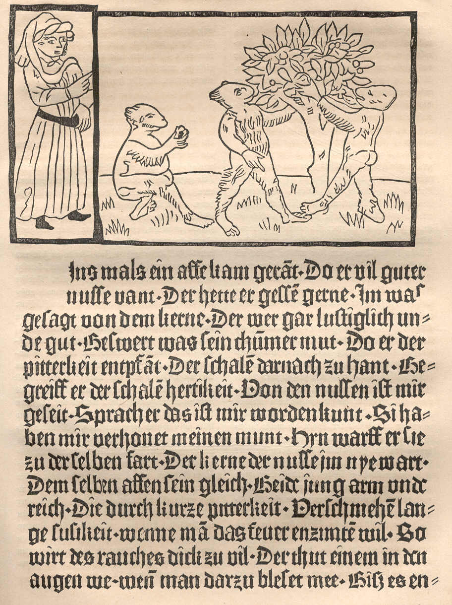
Design innovation took place in Germany, where Alrecht Pfister, Gunther Zainer and Johann Zainer Illustrated books with woodblock prints. In contrast to the theological and scholarly books published by most other early paintings of the Romantic school were focused on spontaneous expression of emotion over reason and often depicted dramatic events in brilliant colors. Pfister and others printed popular literature. Gunther Zainer introduced a greater tonal range to page design by creating woodcuts with textured areas and some solid blacks. Johann Zainer's illustrations used a very even line weight, his capital initials were printed rather then added later by hand, and the experimented with enclosing only a portion of the illustration in a rectangular border to allow white space flow from wide margins into the pictures. This light design affect was complemented by simple outline initials. Erhard Reuwich was the first illustrator to be recognized as such in a book. He introduced the crosshatch technique and was the first to use foldout illustrations.


Examples of Gutemberg's Bible Prints

The German Illustrated Books
Design innovation took place in Germany, where Alrecht Pfister, Gunther Zainer and Johann Zainer Illustrated books with woodblock prints. In contrast to the theological and scholarly books published by most other early paintings of the Romantic school were focused on spontaneous expression of emotion over reason and often depicted dramatic events in brilliant colors. Pfister and others printed popular literature. Gunther Zainer introduced a greater tonal range to page design by creating woodcuts with textured areas and some solid blacks. Johann Zainer's illustrations used a very even line weight, his capital initials were printed rather then added later by hand, and the experimented with enclosing only a portion of the illustration in a rectangular border to allow white space flow from wide margins into the pictures. This light design affect was complemented by simple outline initials. Erhard Reuwich was the first illustrator to be recognized as such in a book. He introduced the crosshatch technique and was the first to use foldout illustrations.


| About The Author | ||||
|
If you enjoyed this post, please retweet or stumble to say thanks!
Subscribe to:
Post Comments (Atom)


0 comments:
Post a Comment