
Thursday
6 London 2012 Olympics logo. Is it a disaster?
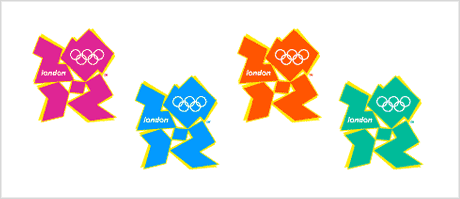
Today saw the launch of London’s 2012 Olympic logo.The jagged emblem, based on the date 2012, comes in a series of shades of pink, blue, green and orange and will evolve in the run-up to the Games.It shows the numbers 2012 in a design aiming to appeal to today’s Internet generation. Sebastian Coe, chairman of London’s 2012 organising committee, said: “It is an invitation to take part and be involved.”

The brand identity was designed by Wolff Olins. Given how they were chosen as the designers over a year ago, I find the results disappointing.
Quite a few others are showing their dislike of the new logo too. .
What do you think?
The brand identity was designed by Wolff Olins. Given how they were chosen as the designers over a year ago, I find the results disappointing.
Quite a few others are showing their dislike of the new logo too. .
What do you think?

| About The Author | ||||
|

If you enjoyed this post, please retweet or stumble to say thanks!
Subscribe to:
Post Comments (Atom)


6 comments:
muhahahahhahhahah weird
yippeeee muhahahhahhahaha plop drop me in kindy marten topopopmushjdehfhoahofhohofweihjhoejcohrohohaisdhohodaoeihiohfaidajlalJEPJOQR[O
soup_rulz from minecraft if u see this u r dead
not at all. It can't be disaster but it may be disliked by many people.
These are looking very different logos, anyways but the work is appreciated.
Beautiful Portray the ideas of logo designs. I very much like your article. You write in the easy way that every designer can understand it. Logozila is the new era of design company that can make nay type of logos.
Post a Comment